Serving as a dashboard of various services for Kansas State University, K-State Connect was in need of a re-designed navigation system. The K-State OME Web Team wanted to provide better access to the “widgets” within the Connect dashboard for both large and small screens.
Large Screens
For large screens, we decided on a dropdown list of each of the activated widgets. The dropdown list appears when hovering over the “Dashboard” navigation item. This was done with pure CSS, no JavaScript required. If for some reason the sub-nav is not accessible, the menu item works just as a normal link, taking the user to the dashboard page when clicked/tapped.
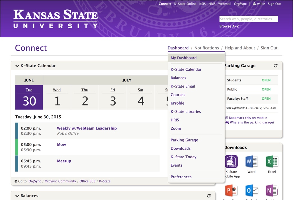
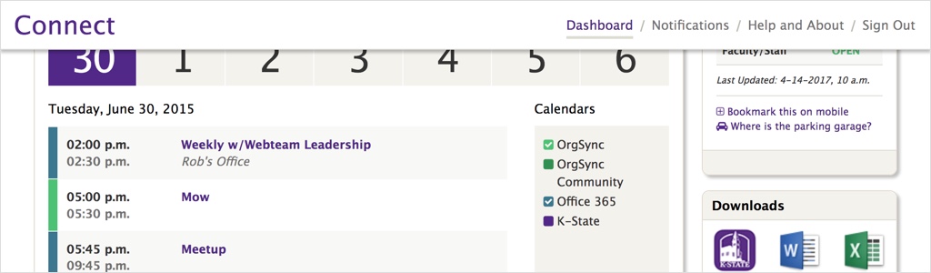
If JavaScript is available, the nav bar sticks to the top of the screen, allowing access to the menu at all times.
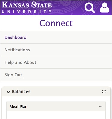
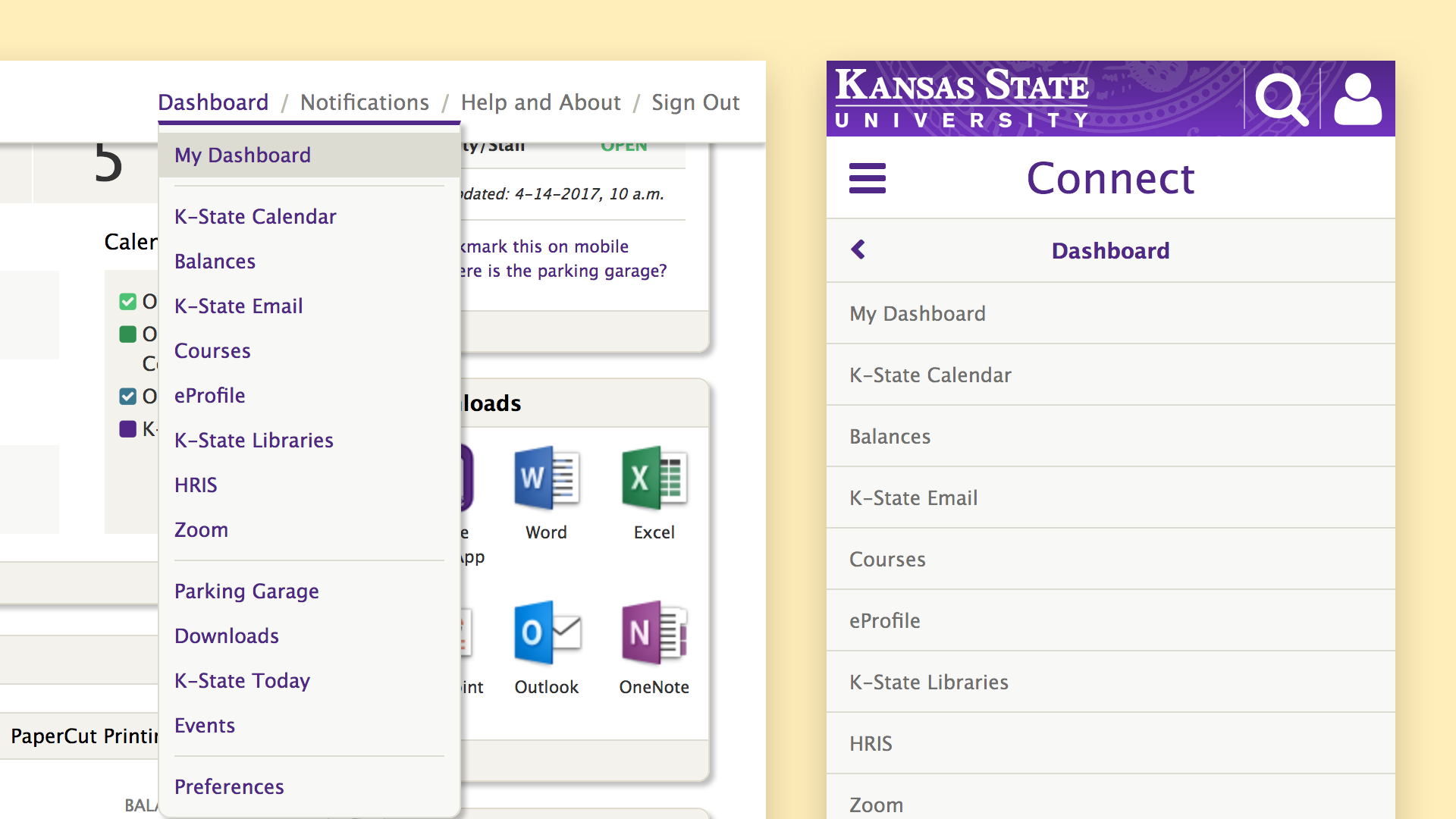
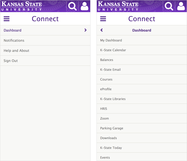
Small Screens
On small screens, the nav bar also sticks to the top of the screen when scrolling, just as it does on large screens.
When open, the navigation expands to the full height of the screen. Clicking/tapping a menu item with sub-navigation will open the sub-nav.
When JavaScript is not available, the main menu items are displayed at the top of the page and the sub-nav is hidden, leaving only the absolutely necessary items and making the navigation as small as possible.